
Abstract
Over the last two months, our OPEnS Data logging hub in the HJ Andrews forest has relayed over 100,000 data points to our Google Spreadsheet through the transmission protocol below. This post will provide a brief look at some interesting trends found within our dataset.
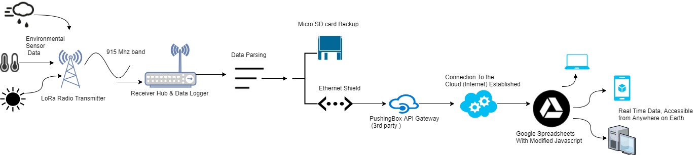 Data Transmission Diagram
Objective
The Objective of this post is to look at some POI within our data set including some interesting plots of data during the Great North American Eclipse.
Data
After collecting data points every 5 minutes for a little over two months we were fortunate to begin looking at the wealth of valuable data we had collected. As I began to analyze specific areas of the data that I found interesting, I was able to see some pretty fascinating trends that one would expect to see such as the Inverse relationship between relative humidity and temperature. I then began exploring other trends within the data and found that although some trends were expected some were not.
 Graph showing the inverse relationship of relative humidity and temperature
 It became clear after looking at the load cell data (well after all water we added to the system would have evaporated) that there was a periodic fluctuation much greater than any residual noise would account for. When plotted alongside daily temperature, it was clear that fluctuations were temperature dependant and we deducted that the exposed aluminum force gauge was expanding with high afternoon temperatures and contracting with colder overnight lows. This behavior visible in the graph below.
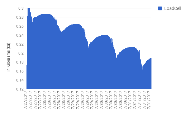 Our data is not without its issues, We found our load cell (evaporation mass) data was greatly compromised by the thermal expansion properties of the aluminum rod throughout daily temperature fluctuations.
All issues aside, we were able to capture some pretty remarkable data during the Great North American Eclipse on August 21st, the below plot focuses on the point of totality, and how this event altered the standard linear trend of light intensity increase throughout a morning with a very steep fallout in both the Infared and Full spectrum light intensity. This anomely can be viewed below.
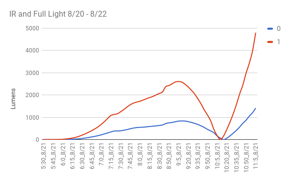 Light Intensity Data during the Total Eclipse 8/21
Conclusions
After briefly looking at the data from this spreadsheet it clear that a more in-depth analysis will be required to really gain an understanding of the relationships and trends within the data set. However, even at a glancing look, it is clear from the strain gauge and temperature relationship will be a major consideration in the redesign and further models of our sensor suites.
-Tom DeBell